Designing effective signage requires a nuanced understanding of how text, graphics, and overall sign size correlate with environmental factors to ensure optimal readability and safety compliance.
The NZS/AS 1319:1994 Standard provides essential guidelines on how to tailor signage to its intended setting, focusing on lighting conditions, viewing distances, and the specific environment where the sign will be placed. This alignment ensures that safety messages are conveyed clearly and effectively.
Key Design Considerations According to AS 1319
NZS/AS 1319:1994 underscores the importance of designing signage that is easily legible from a normal and safe viewing distance. This involves careful consideration of the size of both text and graphics relative to the environment they are in.
The standard delineates specific requirements for text and pictogram sizes to ensure that signs are comprehensible at various distances, particularly in well-lit, open work environments:
-
- Upper Case Text: Should be at least 5mm in height for every metre of viewing distance.
-
- Lower Case Text: Requires a minimum height of 4mm per metre of viewing distance.
-
- Pictograms: Should maintain a proportion with a minimum size of 15mm per metre of viewing distance.
These guidelines are designed to guarantee that signs are not only visible but also legible, providing crucial safety information without causing strain or confusion to the viewer.
Practical Application and Quick Reference Guide
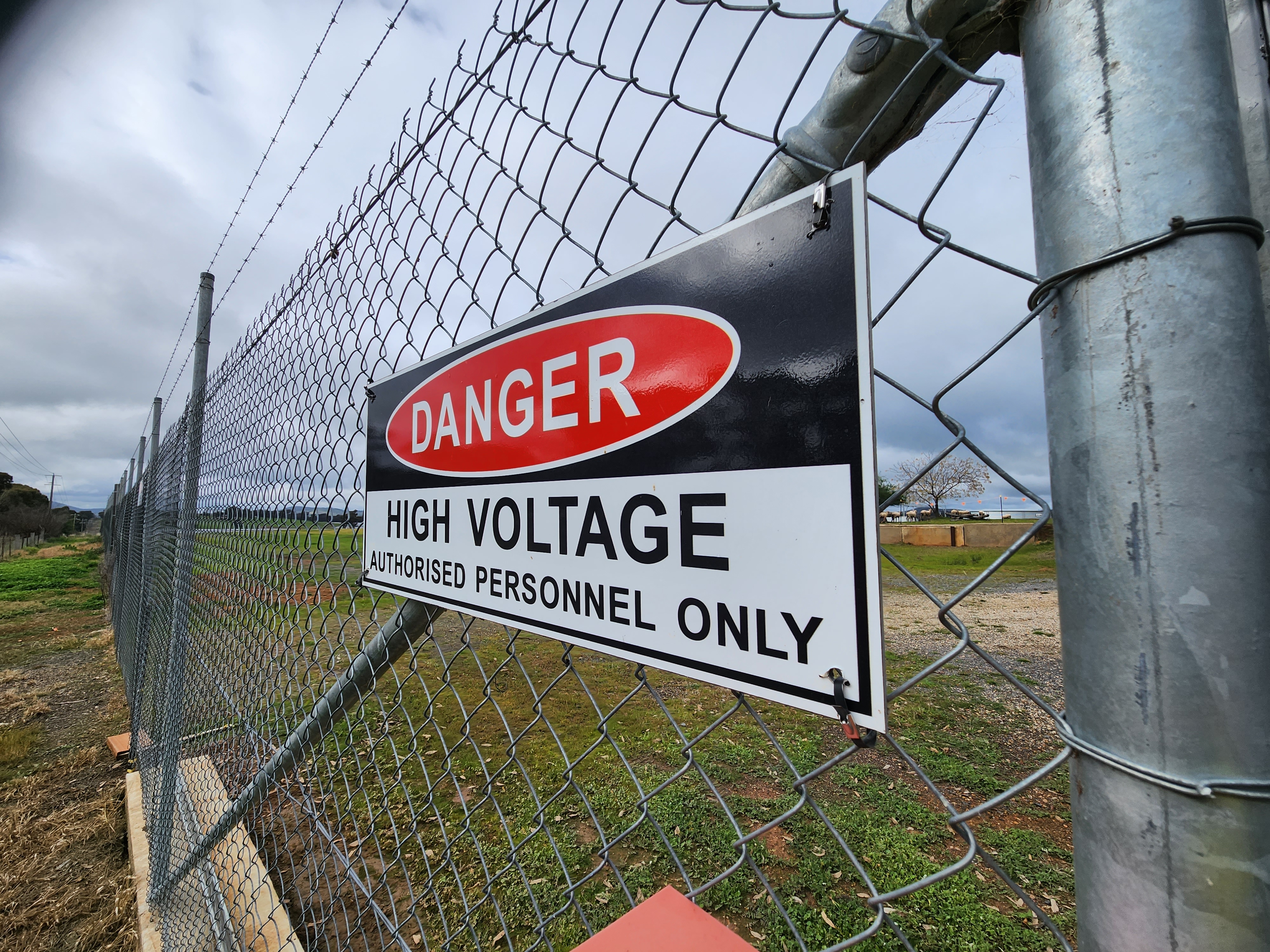
When it comes to practical application, especially in settings such as perimeter fencing around a facility, adhering to these size guidelines is paramount.
Below is a quick reference guide that offers a clear perspective on how large signage needs to be relative to the distance from which it will be viewed:
| Viewing Distance (metre) |
Minimum Upper Case Text Size (mm) |
Minimum Lower Case Text Size (mm) |
Minimum Pictogram Size (mm) |
| 1 |
5 |
4 |
15 |
| 2 |
10 |
8 |
30 |
| 5 |
25 |
20 |
75 |
| 10 |
50 |
40 |
150 |
| 20 |
100 |
80 |
300 |
This guide serves as a valuable tool for ensuring that signage around critical areas, like perimeter fences, is designed for maximum effectiveness, aligning with the standard's emphasis on safety and clarity.
Summary
By following the specifications for signage design, you can enhance the safety and efficiency of your work environments.
Whether it's ensuring that a warning sign is readable from across a parking lot or that instructional signage along a perimeter fence is clear and unambiguous, these guidelines help maintain a safe and informed workspace.
Identimark’s commitment to these standards, particularly through our U3 signage solutions, reflects our dedication to providing high-quality, compliant, and effective safety signage that meets the needs of diverse environments and viewing distances.


.jpg?width=3840&height=1200&name=person-working-building-construction%201%20(4).jpg)


.png)

